Proptech Collective

Role: UX Designer, UI Designer, UX Researcher
Tools: Figma, Canva, Zoom, Toggl, Slack, Luma, SquareSpace, Beehiiv, Fathom
Objective: Website Re-Design
Timeline: 3 weeks
Team: Lauren Johnson, Shuchi M., Isaac H. & Shima B.
Project Overview
Our team of four UX designers undertook the redesign of the Proptech Collective website, a Canadian organization that connects industry professionals, founders, and entrepreneurs in the property technology sector. The organization facilitates connections through networking events, resources, industry panels, fireside chats, and membership opportunities to boost growth and visibility for professionals in the property technology industry.
Proptech Collective's existing website lacked clarity in communicating the organization's mission, vision, and purpose. Our research revealed that potential members struggled to fully engage with and access the organization's core benefits. Our focus was on creating a clear, low-maintenance website that effectively communicates Proptech Collective’s value while requiring minimal upkeep from their team and integrates current platforms seamlessly.
Role
As a UX and UI researcher and designer on this project, my responsibilities included:
Conducting the website audit and heuristic evaluation
Leading user research and interviews
Synthesizing research data into actionable insights
Creating wireframes and sketches at various fidelity levels
Serving as the primary client communication liaison
Understanding and incorporating the technical limitations of Squarespace implementation
Ensuring integration with existing tools (Luma and Beehiiv)
Creating summary presentations to showcase our work and proposed solutions
While our team collaborated on all aspects of the project, I was particularly instrumental in the research and design phases, ensuring that our solutions maintained a balance between the client's limited maintenance capabilities and the users' needs for clear information.
Process & Scope
Our team employed a comprehensive UX research and design methodology to ensure our redesign would meet both user needs and client requirements:
Discovery Phase
Heuristic Evaluation: We conducted a thorough analysis of the existing website, identifying key usability issues and opportunities for improvement.
User Interviews: We spoke with current and potential users to understand their needs, pain points, and expectations.
Comparative and Competitive Analysis: We examined similar organizations' websites to identify best practices and differentiation opportunities.
Analysis Phase
Affinity Mapping: We organized our research findings to identify patterns and priority areas.
Persona Creation: We developed the "Dave Patel" persona based on our user research to represent the typical user journey and pain points.
Problem Statement Formulation: We crafted a clear problem statement to guide our design process.
Sitemap Evaluation: We assessed the current site structure and identified navigation improvements.
Design Phase
New Sitemap Creation: We restructured the information architecture to create a more intuitive user flow.
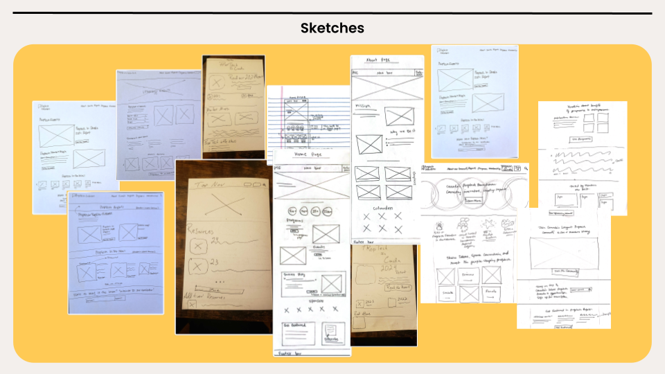
Sketching: We explored multiple design concepts through quick sketches.
Low-Fidelity Wireframes: We created basic wireframes to establish layout and content hierarchy.
High-Fidelity Wireframes: We developed detailed wireframes incorporating the client's branding and content requirements.
Validation Phase
Usability Testing: We conducted tests with representative users to validate our design decisions and identify any remaining issues.
Client Feedback Sessions: We regularly presented our progress to the client to ensure alignment with their needs and constraints.
DISCOVERY
ANALYSIS
DESIGN
VALIDATION
Heuristic Evaluation & Site Audit
Our team conducted a comprehensive heuristic evaluation and detailed website audit of the Proptech Collective website. The audit involved examining each individual page, all links, content, layout elements, and identifying errors throughout the site. We systematically evaluated the site navigation, ranked each issue by priority (medium or high), and documented any broken or incorrect links. While the website wasn't critically flawed, we identified several key areas requiring attention to better serve users and meet the organization's goals.


Competitive Analysis
To inform our redesign strategy, we analyzed six comparable organizations: TechTO, Greentown Labs, Venture Center, Brite Energy Innovators, AIGA, and Proptech Denmark. This analysis identified industry best practices and effective design patterns that could enhance the Proptech Collective user experience.
Effective Design Elements
Clear Value Propositions: Organizations like TechTO and Proptech Denmark excelled at communicating their purpose and member benefits immediately on their homepages
Strong Information Architecture: AIGA demonstrated exceptional content organization with intuitive navigation paths
Visual Storytelling: Greentown Labs effectively used high-quality imagery and impact metrics to convey their mission
User Pathways: Venture Center created clear journeys for different user types (startups, investors, mentors)
Community Showcase: Several sites effectively highlighted member success stories and testimonials to build credibility
Consistent Branding: Brite Energy Innovators maintained strong visual cohesion throughout their site
Common Pitfalls
Complex multi-level navigation structures created user confusion
Excessive content requiring substantial scrolling
Important information buried several clicks deep
Inconsistent visual design across different sections
Cluttered layouts that diminished focus on key messages

Our team conducted 12 user interviews with non-members, members, and individuals that have been active in a professional organization. The insights gained from these interviews allowed us to better understanding the most valuable pieces of content that users seek out on websites for professional organizations. We utilized affinity mapping to organize user pain points, behaviors and wants. We then used that information to help us decide where to focus our efforts and how we could implement solutions.
“[The team] asked questions that we should have been asking years ago”
User Interviews
Persona & Problem Statement


Target Audience
Our target audience consisted of entrepreneurs and industry professionals in the property technology space who were looking to:
Connect within their existing network and expand their reach
Gain insights and resources to propel business growth
Increase visibility for their ventures
Find capital resources and learning opportunities
Connect with potential clients, partners, and customers
The primary user personas included:
Proptech founders and executives (both members and non-members) who were building proptech businesses in Canada and seeking business connections, entrepreneurial education, and investor access.
Sponsors (service providers for proptech companies and real estate companies) who were interested in:
Accessing the founder community as potential clients
Building brand association with innovation and ESG initiatives
Sourcing proptech vendors for their real estate operations
Key Insights

Our research revealed several critical insights that shaped our design approach:
Technical Constraints
The redesign needed to work within significant technical constraints:
Implementation in Squarespace (the client's existing platform)
Minimal maintenance requirements (90% volunteer organization)
Integration with existing tools (Luma for events, Beehiiv for newsletters)
Design Sketches
Our team moved on to sketching where each of us took a turn ideating and generating initial sketches for new layout and content structure. We collaborated and combined ideas into our new re-design.
Site Map
Our audit of Proptech Collective's original sitemap revealed several challenges including confusing navigation, inconsistent hierarchy, and content fragmentation across too many separate pages. To address these issues, we undertook a comprehensive reorganization of the site structure.
We began by cataloging all existing content and identifying logical relationships, then prioritized information based on user needs and business goals. The redesign process focused on simplification, consolidating similar content types (such as Intelligence, Insights, and Market Maps) into a unified "Resources" section while ensuring critical information was no more than two clicks from the homepage.
The final sitemap featured a streamlined navigation with clear categories (Home, About, Events, Resources, Join), logical content groupings, and simplified paths to high-value content. This refined information architecture created an intuitive user experience while supporting the client's requirement for a low-maintenance website.


Implemented Solutions
Structural Changes
We redesigned the site's information architecture, focusing on four key pages:
Home Page: Redesigned with improved hero section, clearer value proposition, and strategic calls to action
About Page: Restructured to better tell the organization's story and showcase the team
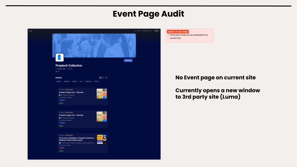
Events Page: Reorganized to highlight upcoming events while maintaining the Luma integration
Resources Page: Created by combining the previously separate Intelligence, Market Maps, and Insights pages for better content organization
Visual Improvements
Utilized existing brand assets but applied them more consistently and effectively
Improved content hierarchy through better typography and spacing
Enhanced navigation with clearer labels and simplified structure
Created a more cohesive visual experience across all pages
Technical Implementation
All designs were created with Squarespace implementation in mind
Integration points with Luma and Beehiiv were maintained
Design decisions prioritized minimal maintenance requirements
Wireframes
Our wireframing approach for the Proptech Collective redesign followed a strategic two-phase process. We began with low-fidelity sketches to rapidly explore multiple layout concepts, information hierarchies, and navigation patterns for our four priority pages: Home, About, Events, and Resources.
After collaborative evaluation and client feedback, we moved directly to high-fidelity wireframes that incorporated Proptech Collective's brand elements, responsive design principles, and integration points with existing tools.
Throughout both phases, we maintained focus on clearly communicating the organization's value proposition while designing within Squarespace's implementation constraints. This efficient approach allowed us to balance visual improvements with the practical reality of creating a low-maintenance solution suitable for a volunteer-driven organization.


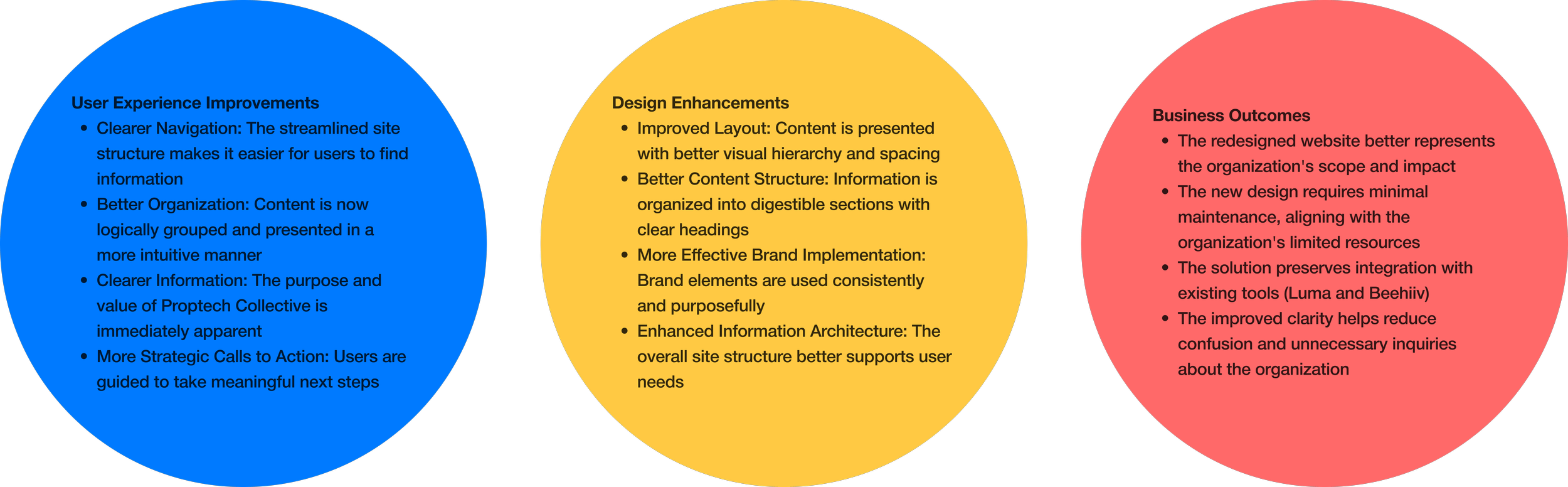
Our redesign delivered significant improvements to the Proptech Collective website, addressing the core challenges identified in our research:
-
The client was particularly pleased with how our solution addressed their key requirements:
Creating a clean, simple website that clearly conveys who they are
Designing a site that requires minimal maintenance
Ensuring visitors quickly understand Proptech Collective's purpose and value
Creating a more effective "hook" to encourage visitor engagement
-
This project reinforced the importance of balancing client constraints with user needs. Working with a non-profit with limited resources taught me valuable lessons about prioritization and designing for sustainability. Creating a solution that was both visually appealing and practically maintainable required thoughtful compromise and creative problem-solving.
The experience of conducting heuristic evaluations and transforming those insights into actionable design changes strengthened my analytical skills. Additionally, serving as the primary client liaison improved my communication abilities, particularly in explaining design decisions and managing expectations.
Most importantly, this project demonstrated how even relatively modest design improvements, when strategically implemented, can significantly enhance an organization's ability to fulfill its mission. For Proptech Collective, a clearer, more intuitive website means better connections between industry professionals, which ultimately helps drive innovation in the Canadian property technology ecosystem.
-
The Proptech Collective website redesign project successfully transformed an unclear website into a clear, purposeful platform that effectively communicates the organization's mission and value to property technology professionals. By addressing the identified information gaps and navigation challenges, our team developed a solution that not only better communicates the organization's value proposition but also requires minimal maintenance—a critical requirement for this volunteer-driven organization.
Results & Impact